

Game Maker Switching From Code To Interactive Design
From the moment Apple launched the first fully touchscreen phone onto the mobile market, handheld devices have been dominated by touchscreen interaction. 4 years ago when Facebook launched Origami, and Microsoft introduced Future of interaction Design, Designers started think about 'Interactive Design' prominent. Now industry is developed, people are not using Green screens, After effects for interactive design.
Interactive Design
An interaction designer is the person on t h e design, development, creative or marketing team that helps form and create a design strategy, identify key interactions of the product, create prototypes to test concepts and stay current on technology and trends that will impact users.
So what really pushes forward the field of interaction design? What makes it different from Visual Design?
Now this matters, Interaction matter. Because the process of designing should reflect the end product. If you're designing a poster, then working on a static canvas makes sense. But more and more of us needs to spend our days designing for interaction.
We're creating mobile and tablet UIs that respond to swipes, flings, taps, and presses. We're designing for a world beyond just looking, pointing and clicking, but that gets into the realm of feel and manipulation.
You can't imagine designing a physical object without thinking about materials and how something will feel in the hand or respond to its environment, It's the same with designing products. For those who design with code, it's a huge advantage to be able to work directly in the medium of the end product. But learning to code is a pretty big barrier and even if you know how, it may still not be an efficient way to design. That's where investing in better design tools comes in.
Interaction works as visual confirmation showing that an app reacts to user commands. In other words, a user must understand how his actions correspond to the apps reaction. For example, when the user presses a menu button, the menu must appear.

Design fundamental
Design fundamental is affected when you move Visual design to Interactive. If some UI element lives its own life or has non-standard behaviour, it can mislead and even irritate users. There is some understanding of the way the objects move in the real world and users expect to see the same on their smartphone screens.
This are the main design fundamentals that we have to consider.
- Color
- Grid
- Layout & Consistency
- Spacing
- White Space
- Typography
- Motion
These are the main fundamental that we follow in Visual Design, Right?
So how it affects, if we change Visual Design to Interactive Design. Not a lot, but for us it's a lot because we focus and create different designs and experience with those fundamentals.
However, so as to successfully design according to the primary human needs, you must achieve a balance between targeting underlying human psychology and preserving the brand or purpose(s) of your product.
1. Color
Techniques that you come across when working on an interactive motions, If you following the same visual design techniques in Interactive design, it will creates a color optical illusions.
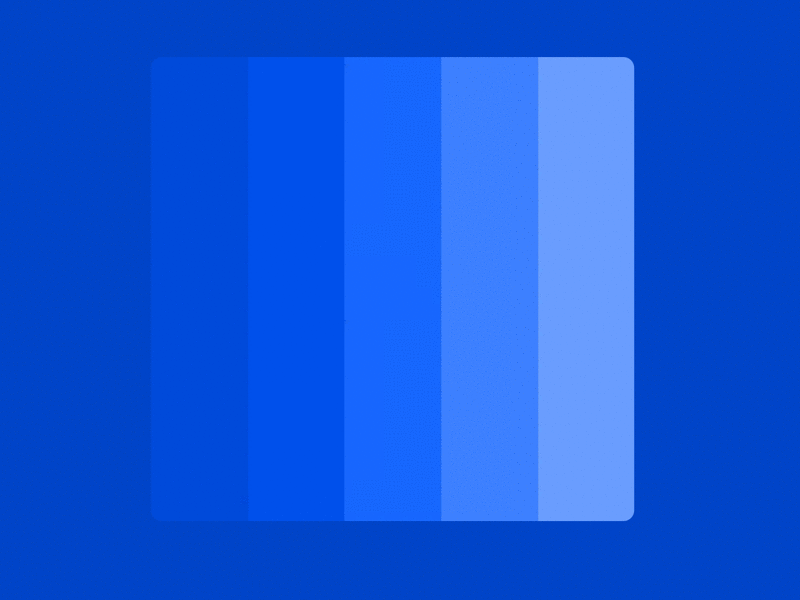
- Mach Bands — Color create a illusions in interactive. Placing shades of the same colour adjacent to each other was a common trend during the flat design era. Looking closely, you may have noticed a false shadow appearing between the edges of each contrasting shade. This illusion is known as Mach bands. No shadows have been added to the image, it's just the way our eyes perceive it!
- Munker White Illusion — This illusion is fairly subtle, but nonetheless fascinating! Looking at the image above, the blocks of purple on the left appear lighter than the purple blocks on the right. Once revealed, both blocks in fact reflect the same amount of light
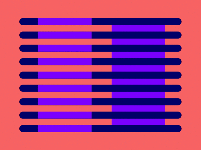
2. Grid
Software developers have tools to help manage screen layout complexity: constraint systems like iOS' AutoLayout and Android's Constraint Layout, Flex-box, and even grid-specific frameworks like the upcoming CSS Grid. But layout decisions should be made by designers, not delegated to developers. They're critical to the form and function of an interface. Designers must be able to explore the consequences of grid layout decisions visually, not just in code.
To create a grid, you typically set parameters like total width, number and width of columns, gutters, and margins: But here we are not using traditional grid systems like Bootstrap, Golden, etc.
Working with only few fixed grid configurations makes it easy to miss problems while you're working. Either the developer will find them during implementation — necessitating a lot of annoying back-and-forth — or the broken layouts will end up in your final product.
For UI designers, grid changes are often necessary. It's just not possible to account for every output and content variable before starting visual design.
8 Point Grid — Vertical Rhythm
always conform easily to the same UI grid as other elements while maintaining vertical rhythm and legibility. Baselining your text is a great tool for developing vertical consistency in designs. By positioning the baseline of each line of text onto evenly-spaced lines, you can easily make motions all of your UI elements into a harmonious vertical rhythm.
Combine 8pt UI grid with a 4pt baseline grid. This pairing keeps the math simple and clean while providing sufficient options to fit a variety of text styles.
So if we changing platforms or baseline with interactions, or moving different elements designer can keep the consistency and rhythm with 8 point grids.
There are actually two prominent versions of this system. One that places elements into a system-displayed grid defined in 8-point increments (we'll call this the "Hard Grid" method) and another that simply measures 8-point increments between individual elements (we'll call this the "Soft Grid" method).
The primary argument for the Hard Grid method is that by using additional transparent background elements and then grouping them to small groups of foreground elements, you can keep track of margin and padding on a per-element basis and just snap these containers to the grid like bricks. Material Design — where everything is already designed to a 4pt grid — naturally conforms to this method.
The argument for the Soft Grid method is that when it comes time to code up an interface, using an actual grid is irrelevant because programming languages don't use that kind of grid structure — it'll just get thrown away. When the speed at which you arrive at a high-quality, programmable set of mockups is a priority, bypassing Hard Grid's extra overhead of managing additional layers in favor of Soft Grid's more fluid, minimal structure can be an advantage. This also can be more favorable to iOS where many system UI elements are not defined by an even grid.
So, Hard grid or Soft Grid? I think it's depend on project.
But I think When all of your measurements follow the same rules, you automatically get a more consistent Interactions.
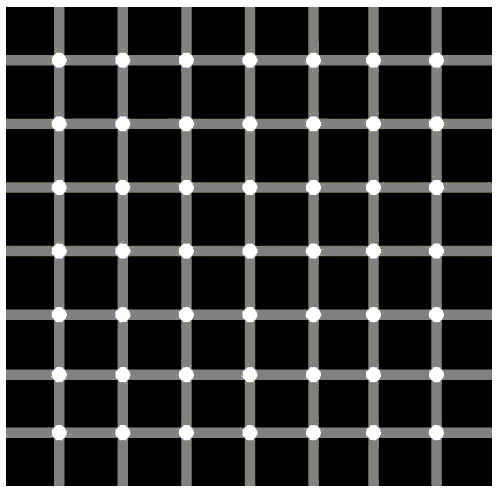
- Hermann grid illusion is fairly popular and can be seen in layouts which contain a grid of squares placed on a high contrast background. Looking directly at any square produces ghost-like blobs at the intersections of the surrounding squares. But looking directly at an intersection will make the blobs disappear.
The reason for this effect is due to lateral inhibition. To put it simply, it is the capacity of an excited neuron reducing the neighbouring neurons in the latter direction.
Watch this videos, you can understand about the illusions.
3. Layout and Consistency
Keep a balance between extraordinary interactive motion and reality. Designers always want to add something new, their "own" to the interface. Interaction is a perfect opportunity for it. Using special effects, you can manage user attention and inspire users to particular in interactive actions. However do not go overboard.
It is very clear and consistent, and creates a strong sense of place for where the user is inside the product. Consistency and Transformation. Avoid unwanted screens and Design elements.
Understanding spatial relations in the brain is key to understanding spatial relations between parts of the design. Science explains that spatial properties, such as location and size, are processed by different portions of the brain to object properties, such as color and shape.
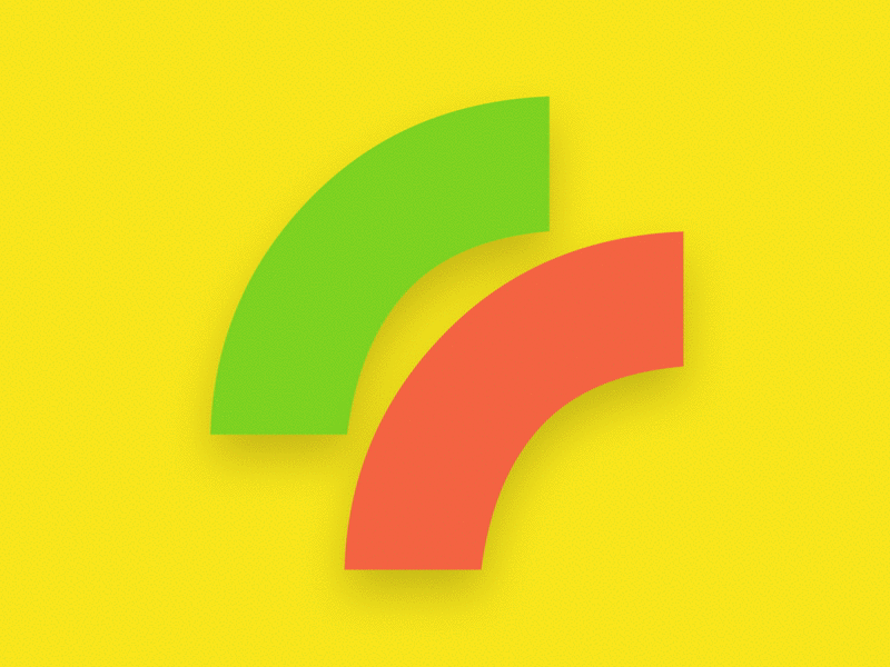
Working on a designs it is a mark or a type requires slicing and dicing different shapes. This illusion occurs when working with curved objects. The two elements appear different in size but upon closer inspection, they are in fact the exact same size.
Does it effect in interactive motions? Yes it does.
Managing the user memory
We all have our limitations, and as complex as the human brain is, it does have its shortcomings. For instance, the way we read content on a screen versus in a book is vastly different. In his study on the Magical Number Seven, the brilliant George Miller declared that
There seems to be some limitation built into us either by learning or by the design of our nervous systems, a limit that keeps our channel capacities in this general range.
That is to say, we are limited in our capacity to process information, and after a certain point, our ability to focus becomes inefficient and passive. Miller explains that by organising, and reducing the cognitive load that our brains have to manage, we will have more luck in keeping focused. He goes on to talk about how "chunking", or grouping relevant information together that can be located and scanned quickly, has had a positive effect on our ability to retain focus on a given task, such as memoization and processing large amounts of information.
4. Spacing and White Space
The concept of minimalism is achieved by condensing something down to its most essential elements. The phrase "Less Is More" is one of the most well-known of the minimalist movement.
User can easily focus in minimal interactive design.
Getting back to basics, that is, grids, typography, spacing, proportion, colors and fitting them together with white space appropriately, is essential. Avoid the frills, noise, redundancy and you can improve user comprehension and retention of your Design and Motions.
5. Typography
"Content is King" Delivering a great user experience doesn't just mean delivering great content — it also means providing that content in a usable and useful format that encourages reading and readable interaction.
Mathematically positioning and movements each types based on its metric height will make the entire word appear disproportionate in terms of visual perception.
A common practice in type mechanics involves a process called overshooting. To put it simply, overshooting is a process of resizing individual characters to achieve optimal balance.
All types need to set in baseline and it help to keep consistent positions and interactions. And maximise the user experience with minimal interactive motions.
6. Motion
Proper motion coincide with the design concept and have approximately equal speed. Otherwise, a combination of smooth and sharp motions can negatively influence the perception of an Design.
If some UI element lives its own life or has non-standard behavior, it can mislead and even irritate users. There is some understanding of the way the objects move in the real world and users expect to see the same on their screens.
The main goal of in interactive motions is to help users and not to distract their attention from the content.
Identical Rhythm
Proper animated effects coincide with the design concept and have approximately equal speed. Otherwise, a combination of smooth and sharp motions can negatively influence the perception of an Product.
At the same time, it's better not to reduce all the interactions within the design to the common speed. Let's say that pressing a button has to be not as smooth as paging the list.
This allows you to smooth motions. User's eyes adjust to the identical rhythm of in motions.
Game Maker Switching From Code To Interactive Design
Source: https://blog.prototypr.io/visual-designer-to-interactive-designer-c32485797edc
Posted by: veseywithat.blogspot.com
0 Response to "Game Maker Switching From Code To Interactive Design"
Post a Comment